Editors Note – the last two images in this article could be disturbing for some readers.
By Harry Huberty and Christina Ladd
Back at Pro Tour Fate Reforged, Wizards announced this summer’s set, Magic Origins. Along with the announcement they gave us a few pieces of teaser art, which hint at a theme of change or transition—the moment when the Magic’s leading cast were set on the path to becoming the planeswalkers we know.
The splash art for the set on the WotC page shows little shaver Jace, with the more brooding adult Jace we all love in the background behind him:
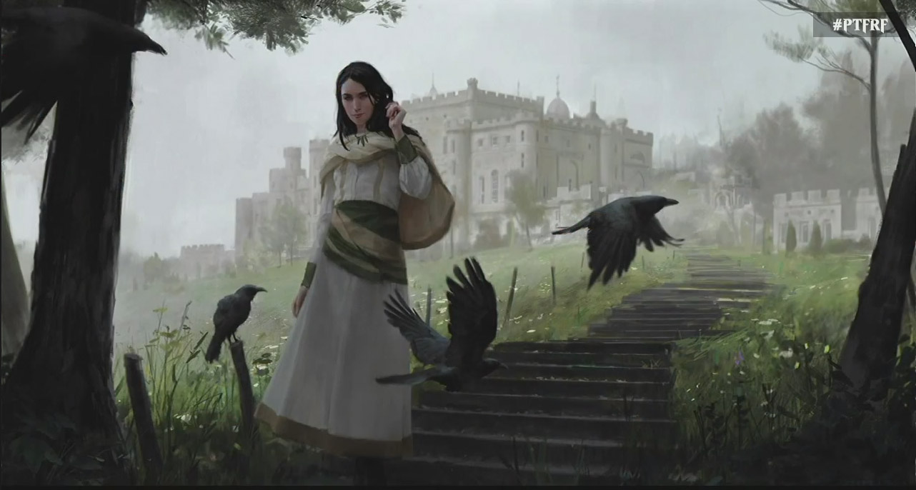
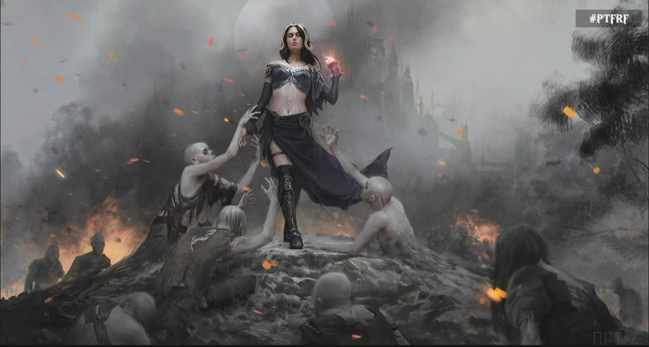
They also teased what seem to be “before” and “after” shots of everyone’s favorite necromancer, Liliana Vess:
There’s not so much to say about that Jace art (he’s younger!), but there’s a lot to unpack with those Liliana shots. So let’s get to it!
Harry: There’s a lot to like about these pieces—both, I believe, by Karla Ortiz, whose tone and shading create such a sense of mood. There’s something unsettling about the first picture: Liliana in the foreground, but shaded by the trees we can barely see. She’s placed off of center, so the piece feels unbalanced. The sky is hazy, and the buildings in the background are starting to fade into the mist. Liliana is wandering away from the solid order of normal civilization.
Christina: Is it me or does the first image look especially like it was created to showcase the amazing graphics of the N64? Something about it—the clothes, mostly—seems incredibly stiff, and her face seems kind of blocky. Otherwise it’s…fine. There’s a bit of hesitation in her pose, some calculation perhaps, but it doesn’t really give me much of a story except, as Harry said, to perhaps suggest that she’s moving away from a more normal life—though I’m not sure if a large, opulent castle is everyone’s definition of “normal.”
H: Contrast that with the second picture: there some fog, sure, but that’s because the entire background is on fire. Liliana is front and center, sharply in focus. There’s light hitting her, as opposed to the shade of the first picture. Before, we weren’t quite sure what we were looking at. Here it’s clear: THIS is who Liliana is.
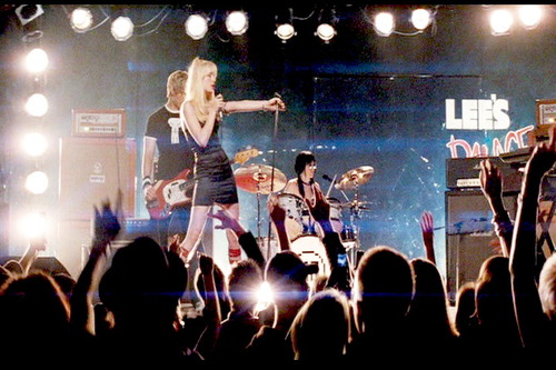
And that pose, too: I love it. It’s almost like a pop diva, with her adoring zombies reaching for her. She’s Envy Adams at Lee’s Palace.
They are in her thrall. She is their idol, their goddess—as much as zombies can have those things.
C: It’s not the same castle (the turrets are different), so I’m not sure how much continuity we’re supposed to assume here, but clearly she has left what she knows behind. The costume change alone says that, but I like her posture: she’s strutting toward the viewer, shoulders back and stride meant to imitate a catwalk (no one usually walks with one foot directly in front of the other). This is not someone with her feet planted, braced for further combat. This is a woman who’s already won.
H: The contrast between the two opens space for a reading which taps into a shared cultural trope of innocence and chastity versus evil and sexuality. Little Lili (who is a healer, at first) is young and dressed in conservative robes: sensible skirt, long, loose sleeves, wide cuffs, even a little mantle and cape. Tightly wound, but fairly shapeless. Lots of white. Post-Lili is all exposed skin: bare shoulders, exposed midriff, sarong with a slit up one side, high boots, garter on one thigh. And now, not a healer, but a necromancer.
So there’s the possibility to read this as “youth-innocence-purity-chastity-good” and “adulthood-experience-sexuality-evil.” But I think something slightly more complex is going on here. Those tropes are there, for sure. But I think they’re less there as an endorsement and more as a function of (and a means for) storytelling in a visual medium.
We have two pictures here which are telling us a lot. There is transformation as one becomes the other. That packs a lot of story into just two pictures. But part of telling that much story means tapping into our cultural vocabulary, and using those visual tropes to shorthand some of what’s going on. These tropes are among the tools the artist uses to tell the story.
They also function on a deeper level than just showing chasteness vs. sexuality. In a real way, the costume change shows us Liliana’s true character: young Liliana is wrapped up and covered over. Post-transformation Lili can expose who she really is, so to speak.
C: I agree that post-transformation Liliana is clearly in full possession of her power and confidence—look at that languid hand glowing with magic, the way she ignores the zombies . Lili don’t give a fuck. I think this set of cards does a nice job of demonstrating how false that virgin/whore dichotomy can be, since generally the trope exists to differentiate two different women. Here Liliana displays elements of both, and yet remains aloof from the entire issue of sexuality, since the other beings depicted are animals or undead, neither of which are sexual objects. She’s just so far beyond or above it all.
H: If this is a story about growth from youth to adulthood, it’s hard to separate that from sexuality. Maturing sexually (physically, emotionally, and socially) and learning to accept these new aspects of yourself, is a big—maybe the biggest part—of adolescence.
C: I have to disagree here. Just because she’s showing more skin doesn’t necessarily mean she is sexually mature. To me it speaks more to the defiance and experimentation of adolescence than the maturity of later cards—Liliana is figuring out who she is and how she wants to present herself. It may just be me, but I don’t find either image particularly sexually appealing or unappealing—to me, sexuality is more incidental to these images. Especially the later image; a burning wasteland of reanimated corpses is not a sexy spot, not even for Liliana. She has such opulent taste, after all.
H: True that. WotC is in an interesting situation here—cultural tropes are a major tool for telling these visual stories, which are a medium which requires economy. They need to tap into our visual vocabulary to get their points across. But by making use of those tropes, they risk replicating and endorsing them.
I think it’s also helped by the fact that Liliana has consistently been Magic’s femme fatale, ever since they introduced her as one of the original planeswalkers, back in Lorwyn.
She’s gone through some slight costume tweaks, most notably her corseted phase in Innistrad. But most of the character and costume has remained consistent: dark purple colors, shoulderless top, exposed midriff, sarong skirt, high boots. The garter is canon too, I believe.
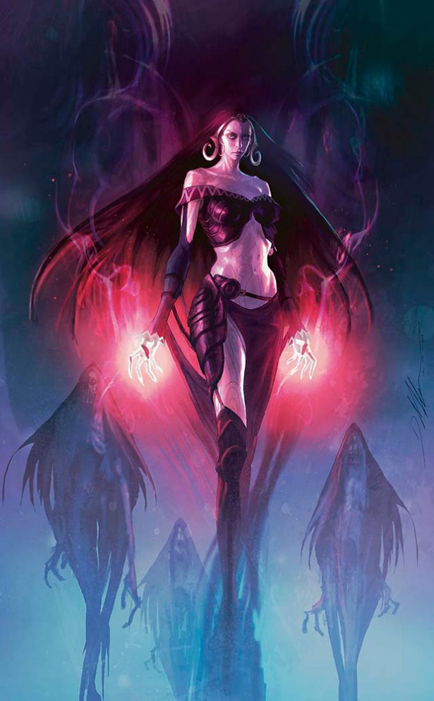
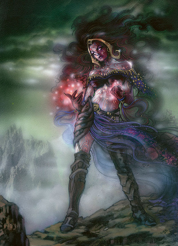
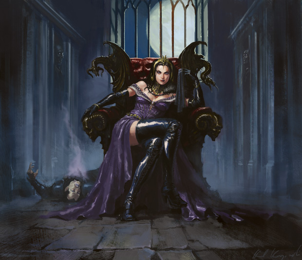
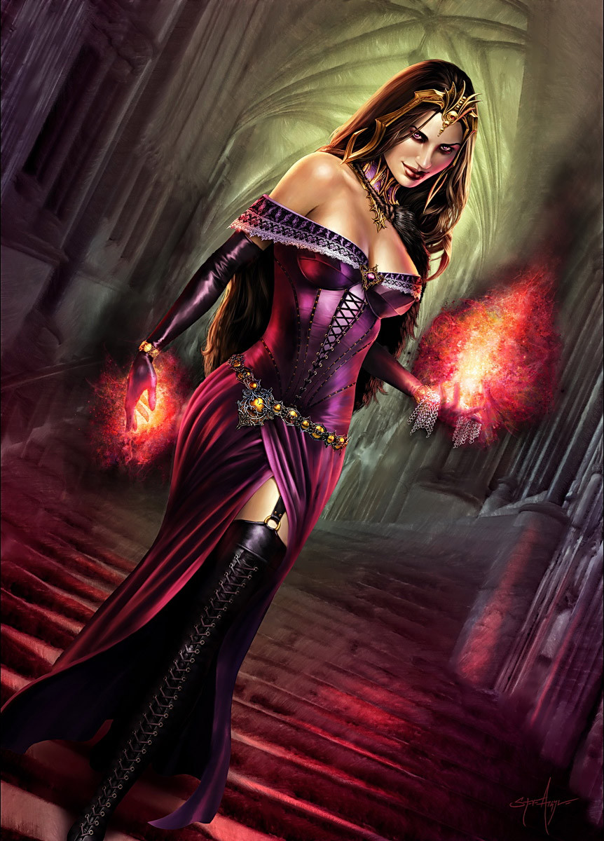
Liliana been rendered on promo art a number of times—possibly more than any other planeswalker besides Jace; I haven’t counted—so we have a lot of images to reference. Taken as a corpus, we get a sense of what’s important to Wizards as they depict the character.
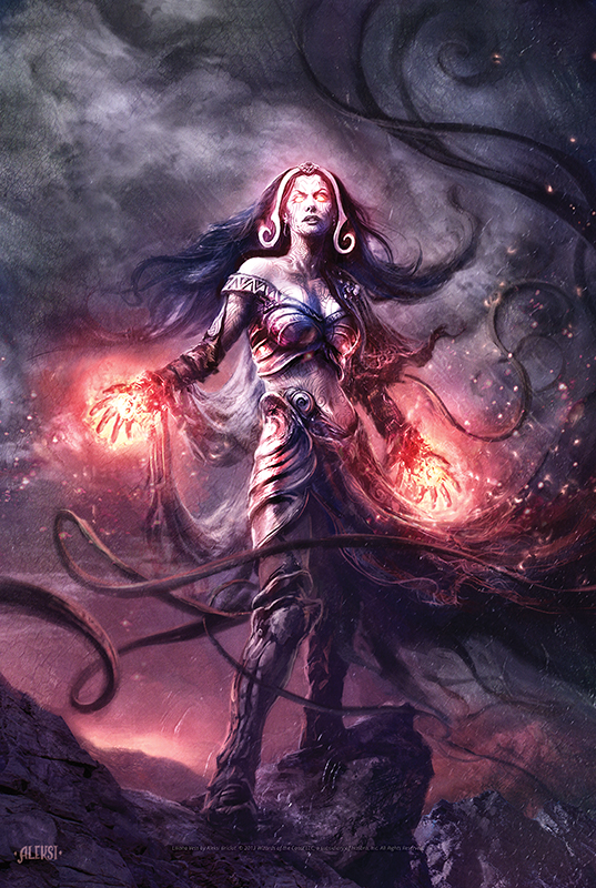
She’s certainly got that femme fatale thing covered. As much as she’s rendered attractively, there’s a sense of danger that exudes from these pictures. The juxtaposition between the alluring and the threatening is, again, a mainstay cultural trope. That said: is there too much gratuitousness here? Too much cheesecake? The art for Liliana of the Veil really goes out of its way to emphasize that exposed shoulder, the slipping top, the slinky pose.
C: I think it’s worth pointing out that femme fatales don’t have to show a lot of skin (or any, really) to earn the title. They only have to be women both attractive and dangerous to men. Femme fatale is a widely applicable term that I think has an inherently sexist undertone to begin with, since it’s considered unusual for a woman to be potentially dangerous to a man; conversely, the term for a man who is potentially dangerous to a woman is “man.”
Still, we have to give credit that many of these depictions bring the danger before the allure. Again, it may be me, but I don’t find that my first emotion when seeing any of these is attraction, except for the last one. The glowing tattoos, the wraiths in the background, the throne…there are sexual elements, certainly, especially Liliana’s outfits (also, the corpse in the third image has a distinctly post-coital pose), but there is more story than mere seduction here. What’s going on with the tattoos? Who are those wraiths? What is Liliana doing on that throne, and who’s the stiff? Only the last one is too cheesecake-y, with no real story (glowing hands aren’t really a story in fantasy art, they’re just shorthand for “mage”).
H: Yeah, one of my pet peeves is using the power of the women depicted to justify sexualized art: “It can’t be sexist; she could kill you.” “She’s pretty, but she could kick your ass, so it’s fine.” When a picture is drawn for the male gaze, it doesn’t really matter whether it depicts a “strong” woman or not.
C: True, the narrative elements don’t negate the exploitative elements, but we also don’t want to issue a blanket condemnation of sexuality and sexual expression because certain kinds of representation are sexist. It’s okay for Liliana to be sexy. To me, the things that work against exploitation in images are narrative and action. Does the card show her doing something, and for her own reasons? Then she’s not an object, she’s a subject. More generally, the thing that will help Liliana not be seen as sexist is diversity. If we are able to see diverse representation of women, including body types, skin color, costume, and role, then we have a better chance of understanding Liliana as a woman and a character, not the woman standing in for all women in MTG.
H: Great point. For a long time, fantasy properties had only a handful of female characters, so showing just one as overly sexualized makes an implicit statement about how the creators of that property view all women.
Taking Liliana’s story into account, her character design does show more complexity. Now, again, “[story reasons]” is one of the worst defenses of sexualized art, so we’re in tricky territory here. But I think there’s some stuff that’s worth exploring.
Liliana sold her soul to several demons in exchange for power and longevity. Part of that deal was renewing her youth and beauty. Given that, it makes some sense that she’d want to show it off. And on top of being a compelling character beat, it speaks to the narcissism of a black mage that she’d include “make me hot forever” as part of a pact with demons. A woman who is comfortable with her body and sexuality, who shows it off in a way which glorifies it—this all really fits black’s color philosophy, which elevates the self above all else. Liliana loves who she is.
C: Though MTG has stressed that black is not Evil (and even had a mono-black hero in Kamigawa, Toshiro Umezawa), it would be nice to see a heroine who embraces self-love and sexuality in another color or colors. Maybe blue-green, like a Simic? We get into uncomfortable territory here with her alignment, since there is some implication that female sexuality is nefarious. Hey, maybe we can get Starfire to be a MTG heroine. DC isn’t treating her very well, that’s for sure.
H: Hm, you might like Kiora, the blue-green merfolk planeswalker. She thinks she’s pretty awesome—way more awesome than that loser god Thassa. But I digress.
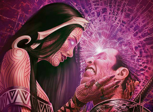
Liliana’s exposed skin also pulls some story weight: her contract with her demonic creditors is literally etched into the runes on her skin (which flare up when she performs powerful magic). You can see it best on Liliana’s Caress:
Not that the top needs to drop so low in that picture, Steve. But it shows the runes off, if a little too well.
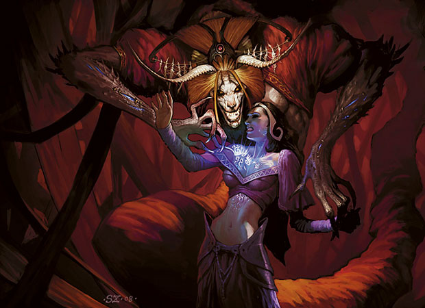
These elements all come together in Scott Chou’s dramatic Demonic Tutor piece:
Game-wise, Demonic Tutor doesn’t actually cost you (the player) anything. But this art gives a sense for what Liliana’s trading for her power. There’s almost a tenderness in the poses, which clashes severely with the cruelty and malice in the demon’s face, and the pain and fear in Liliana’s. Here, the exposed skin conveys Liliana’s vulnerability, and the gulf between her power and the demon’s.
C: This particular image is an uncomfortable one, since there are definite overtones of sexual violence with a demon looming over and touching a scantily-clad woman. It’s not clear to me that the demon is creating or imbuing her tattoos from the position of his hand. If they had made it clearer, even while preserving the facial expressions, I would feel a lot better. Given how disparate the sources are for backstory (the books, stories on the website, flavor text, etc.)—meaning that much can be missed or lost—and MTG’s not entirely spotless history with female characters, I think they need to get a lot better before they present images that grapple with sexual violence.
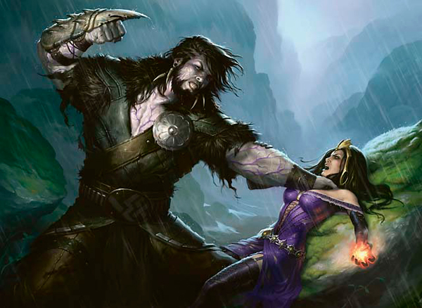
H: Very true. The most infamous example of that, of course, is the art for Triumph of Ferocity, certainly one of the most controversial pieces Wizards has ever done.
To be honest, I don’t think it’s acceptable even if you know everything about Garruk and Liliana. I get that you want dramatic depictions of important story fights between your main characters, but there were dozens of different ways this could have been directed. Understandably, this piece drew a lot of criticism, so much so that Wizards apologized for it, and gave the card new artwork in their Duels of the Planeswalkers computer game.
C: I think there are two major facets to what’s going on here, one of which I feel can be nuanced and one which cannot. The first is that we see a very large, brawny man about to strike a smaller woman who seems to be at his mercy. This is obviously triggering for any situations of abuse, and should have been drawn differently. However, something I have often thought was unfair in many fantasy-related contexts is the explicit or implied assumption that men should not hit women. It’s not that I think men should hit women (I don’t think anyone should hit anyone); it’s that, in a combat situation between people of equal or equivalent power, I believe it is more sexist for men to hold back, since it assumes that women must be inherently weaker. Women must be allowed to be equal combatants.
However, there are certainly many, many more ways to pose this fight without the connotations of abuse. Even if Liliana is losing the fight, she should not be pictured prone, supine, breasts thrust upward. It’s not just triggering, it’s bad fighting style. She should be using her other hand (the one without the lame little fireball) to hold back his grip on her throat, and she should be leveraging herself away or at least trying to protect her torso and/or face. This makes her look unnecessarily weak and bad at holding her own where she should be strong.
The second facet is the lower portion of the frame. Liliana’s thighs are extremely exposed, showing her garter and just barely concealing her crotch. Garruk has one leg thrust between Liliana’s legs, very nearly in contact with her genitals. Garruk’s stance is also wide, his crotch (though covered) turned directly toward the viewer. This is irrefutably a pose of sexual menace. Suddenly, Liliana’s outfit isn’t a source of confidence; next to the belted and leather-decked Garruk, with naked muscles bulging, she looks horribly exposed. No woman on earth can look at this image and not think sexual assault.
Art may not have boundaries, but as I said before, Magic does not (yet?) have the awareness or sensitivity necessary to portray sexual violence. It’s clear from the backlash that they did not consider the ramifications of this image (though at least they were thoughtful and responsive enough to change the card art and apologize); being aware of what you’re doing and thinking it through very carefully is the first and most basic criteria if you actually do want to incorporate any kind of narrative of sexual violence. Further, the story wants us to believe that Garruk is the good guy, the guy who was wronged and in some sense deserves his revenge. This card makes it impossible to sympathize with him, a brute menacing a prone opponent, a half-naked woman. They’re undermining their own narrative with this image.
H: It’s a clear example of how neither immediate context (the story being depicted) nor larger context (the characters and their history) can absolve art that’s poorly conceived or problematic. In apologizing for the artwork in a series of tweets, Magic Brand Manager Elaine Chase noted that each card has to stand on its own. That’s a thing they failed at in this case, though I agree they deserve credit for acknowledging their error and vowing to take it as a learning opportunity.
Triumph of Ferocity is also shocking in part because Magic generally has a good track record, which is steadily improving. They do good work with diverse representations and are consistently trying to have more kinds of people represented. Of course, that doesn’t give them a pass when they mess up—it’s also important to critique the things we love.
From what I understand, WotC’s line on depictions of women is “sexy is okay; submissive/damsel in distress is not.” It hearkens back to what you were saying earlier about being a subject vs. being an object. Women can be attractive, but still in possession of themselves and their stories.
Liliana’s art has had its share of misses, but there’s a lot of good here as well. She exposes a lot of skin, but her skin also works as a multifaceted symbol which represents a lot of things about her: her confidence, her narcissism, the source of her power, the record of her curse. It’s these things which move Liliana past the realm of sexy cheesecake, past the normal femme fatale, into a place where she’s a strong character whose sexiness and costuming represent something. At their best, the elements of story and appearance combine into something more. There’s a synthesis here. There’s complexity.
That context isn’t always apparent from an individual card’s art, but more often than not, Liliana is the subject of her depictions, rather than the object. There’s a line between sexiness and fanservice, and that goes a long way for each individual piece standing on its own.
That’s all for this week, folks! Please join in the discussion in the comments, and remember to be respectful.


I very rarely find depictions of liliana as umm “provocative” as I find them intimidating or unsettling. It’s not like the unsettling of the grotesque you see in a lot of american weird fiction but more the bare intent displayed in the illustration and the only barely checked playful uncaring.
The Demonic tutor art always fit very well with my impression of liliana because I could never picture her on the wrong side of any exchange with anything but contempt and rage. The discomfort really suited my (non-book reader) characterization of her.
The triumph of ferocity art always sort of was unbelievable to me, I guess because I have so little respect for garruk in that kind of exchange? I just couldn’t see that really happening or that it was all some sort of trick up her sleeve. As creepy as it is.
Not that I have particularly a lot of love for lili, but her characterization has always had so much more umph behind it to me than a lot of the walkers. I think an interesting discussion would be evaluating black’s thematic part of the pie and performance as being some of the most 2 dimensional and typical. Every other colour is given great pains to reflect multiple facets of it’s portpolio but black, the one carrying the most archaic and problematic associations.
Anyway lol cute article.
The first part of the article was fine, up until it devolved into “let’s complain about the sexualization of a character who doesn’t exist and therefore lacks emotions, volition, or human rights.”
Can we, as a collective of humans, please come to understand a concept that basic?